ALL STAR

 Children’s Foundation Socail Media Package
  Authentic, approachable, warmth, and real. All words I wanted to highlight for this work. Bringing to life something that needed to bring people who were looking into foster care, just who to look for and how they are looking to help kids and families shine in the best way possible. A way to keep with the very graphic brand identity so to pull from that and still make it stand out to the crowd that are other children foundations. 2 pitches crafted were suggested in the beginning that ended up going through some changes.

RESEARCHING-

JUST WHO IS ALL STAR?

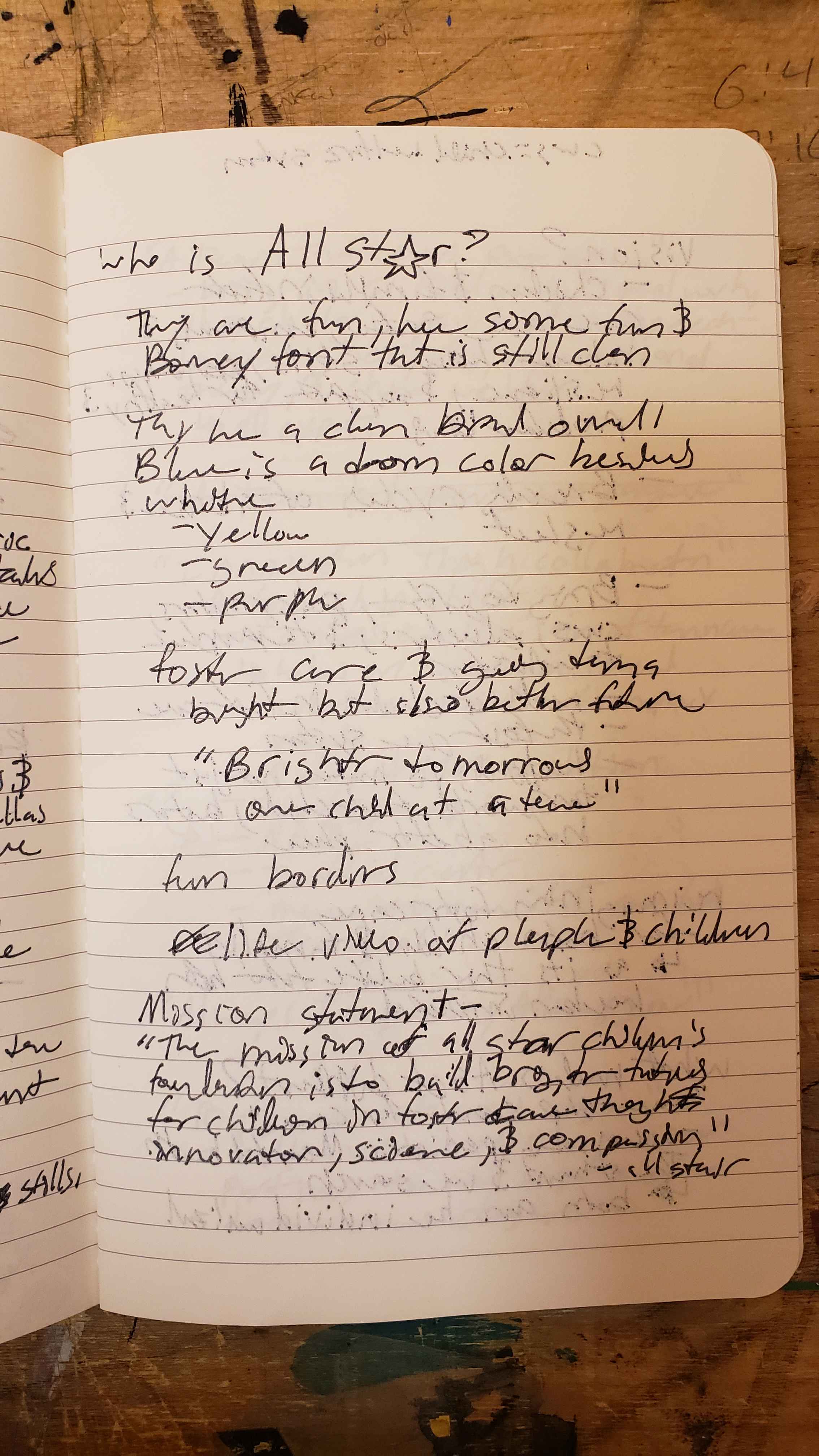
When first researching All Star, they had a unique way of thinking for not just the kids but also the families, whether that be helping the kids or being willing to support them. All Star prides itself on being the one to ask health professionals and scientists questions on how best to support the whole unit, what the most supportive routes to take are, and where they can help build their communities to best give them their support.All that came next from this, truly inspiring, deep dive into All Star was the tough question.

"How do I make people want to learn more about All Star or to even get their eyes on them?"
A few notes from my notebook while resurching All Star

PITCH A: SIDEWALK CHALK

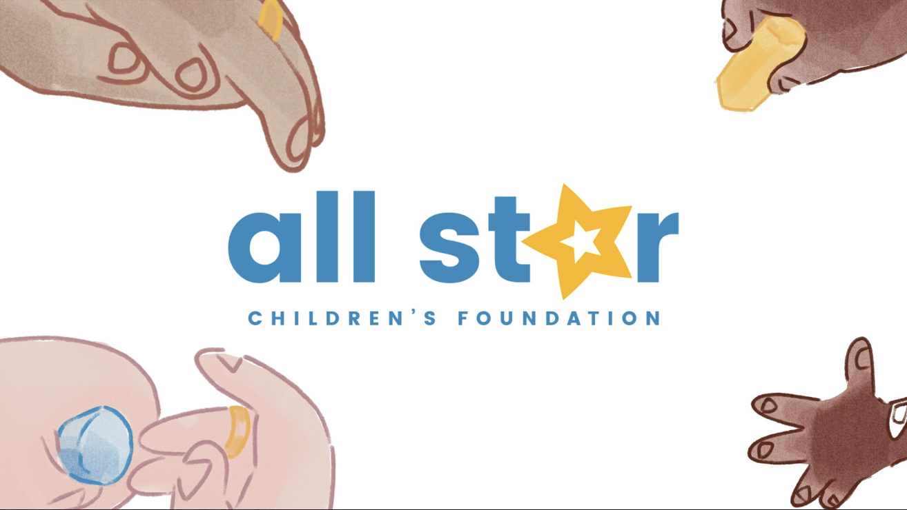
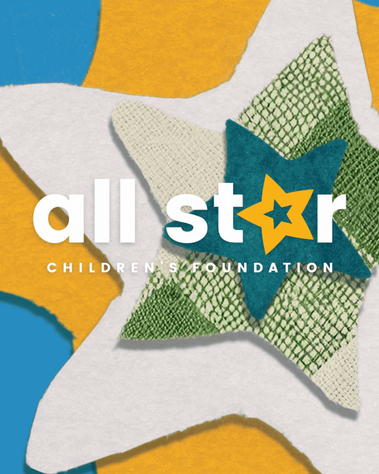
Utilizing the authenticity of cel animation hands would come in and draw out the brand's name. Another smaller hand would come in and draw in the star, showing that families and children are the main importance for the brand

PITCH B: ARTS & CRAFTS

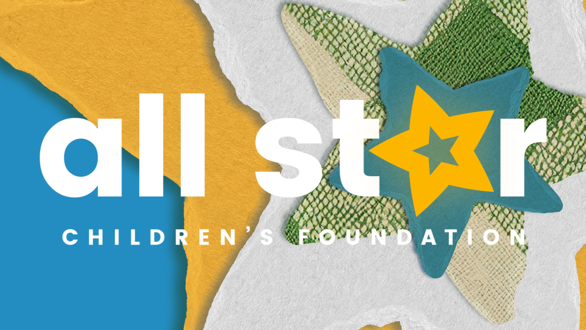
Through the use of frame-by-frame animation and After Effects, the brand would be shown in representation by how, no matter what form, all the stars come together and shine brightest together.

Working in the stop motion labs
02 CRAFTING THE MAGIC
Now switching gears to stop motion animation required some new tools. Getting and making the arts and crafts. How best to build and make the idea come to life, while also not starting from what was pitched. At first, it was the name that was the idea, but then it was dragged back down to the style frame. Which became its own new challenge, seeing as the style frame was more focused on having all the elements in a folder and built in After Effects, but now I had to explore the world in Surcher for my assets.
These here were the beginning storyboards. Of course, these didn't get to be followed through with, but these did help when having to go back to the drawing board a few times. They were some very helpful guiding lights when the challenge got tough to navigate
This was the early stages of this project, and it was starting to prove how much trial and error was going to be poured into this beginning portion.
My washcloth texture, for example. Had to be the truly hardest part of this work, as it would fall apart as soon as it was cut out. Making it a mess to look at and to even animate with. So it was made into a difficult decision to scrap the physical star washcloth texture for a fake washcloth that was on the style frame.
And then the next problem that showed up in this was the colors of the tactile stars versus the style frame. At first, it didn't seem too hard till I had gotten to the blue, and it would not color correct to the blue that was in the style frame. Time after time, refusing to color. However, after some dexterity turning and button mashing and maybe a few tea sips later, it was on point.
Trial and error of learning in the lab space with cutting a wash cloth
After getting all of the requirements needed, I understand how best to color correct the footage. Now it was the fun part, animating the stars! What a hike this hill was to climb. After each pass of working through how best to animate and percent the movement for these wondrous stars. I was now stitching them together in After Effects, after color correcting them, of course, and making the brand feel alive.

There was also a valley and a hill for this, as the rendered videos from Dragon Frame would be flipped from time to time. Making it a bit more of a climb to get the brand to truly shine.
At the end of the day, this project was a lot of fun to bring to life, as there was a lot to enjoy in working on this and bringing in that authentic kind of feeling to it with a return to stop motion animation as a strong builder of how real and tactile the end product looks. I truly do believe this was a good way to pull in the most authentic route for this work, while also helping to bring the shine this group has always had for both the kids and their families. I am very proud to have put a helping hand into making this more visible and to help push that brightness, if only a little bit more.
03 AMONG THE STARS
After such a long road the motion package was at where it could best be at. Stars shining in any momment as they are always have been.

Would you like to see more?

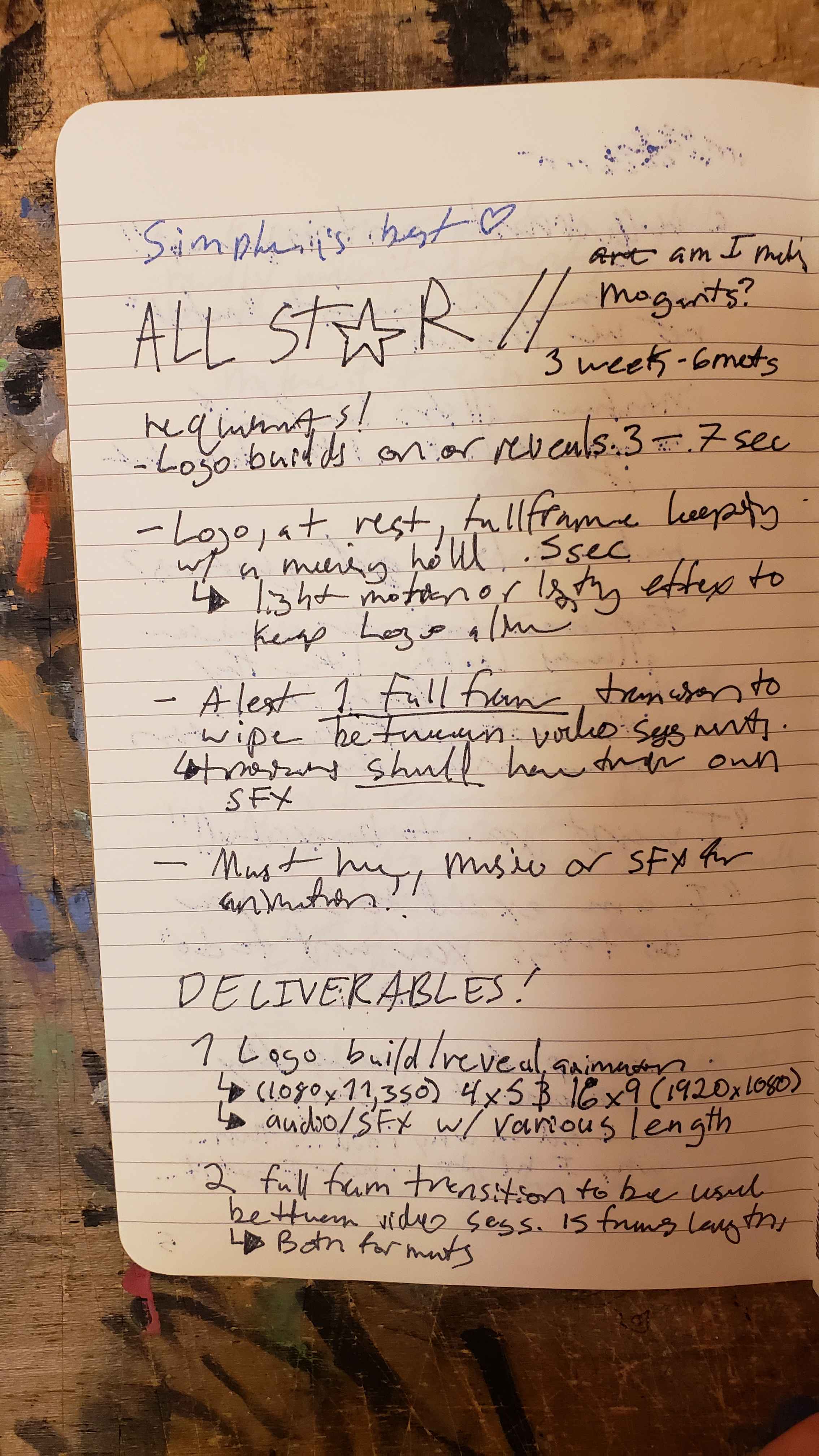
Here are some sugetions

Full Name

Lorem ipsum dolor sit amet, consectetur adipiscing elit.

How we can help you

Full Name

Lorem ipsum dolor sit amet, consectetur adipiscing elit.

How we can help you

Full Name

Lorem ipsum dolor sit amet, consectetur adipiscing elit.

How we can help you

Full Name

Lorem ipsum dolor sit amet, consectetur adipiscing elit.

How we can help you

Full Name

Lorem ipsum dolor sit amet, consectetur adipiscing elit.

How we can help you

Full Name

Lorem ipsum dolor sit amet, consectetur adipiscing elit.

How we can help you